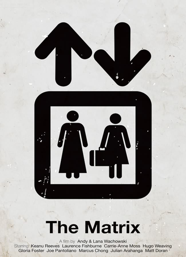
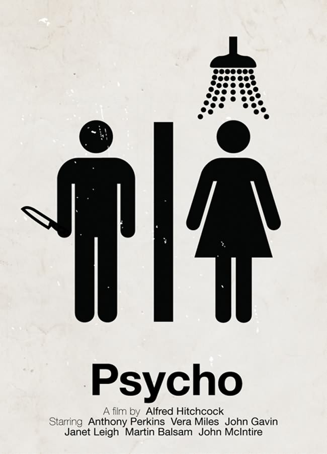
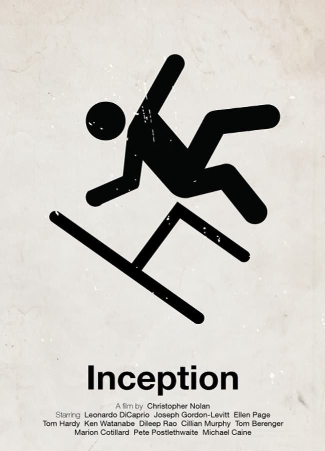
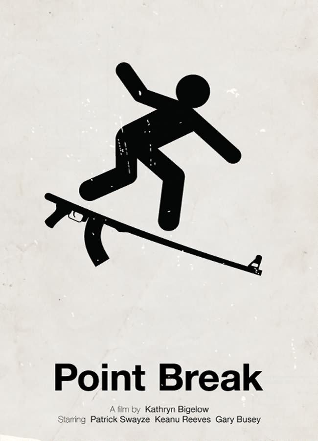
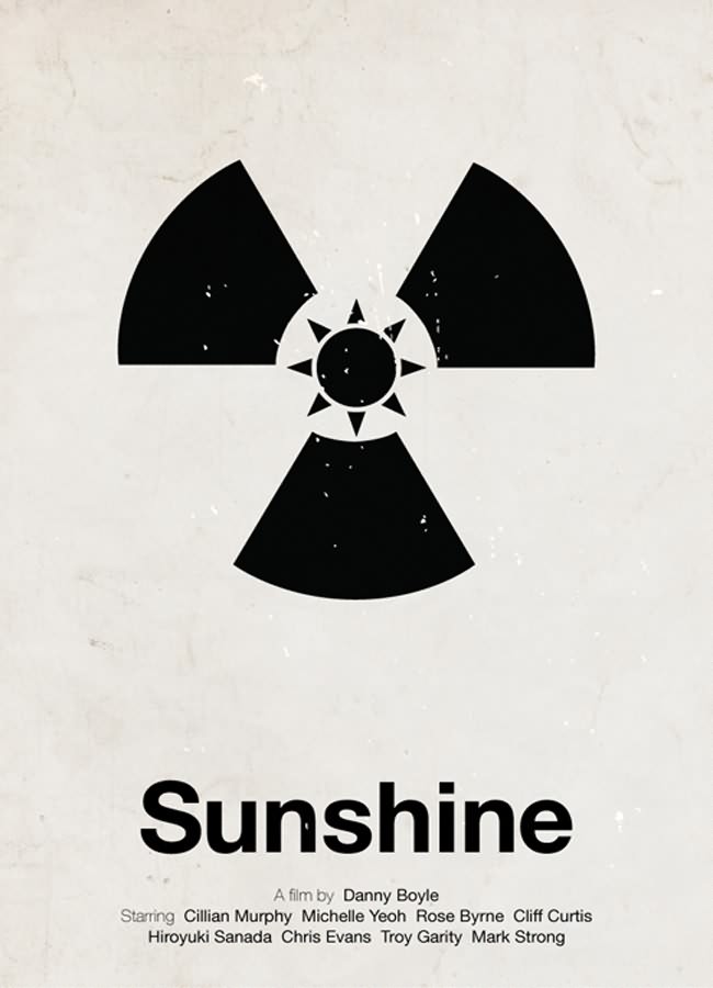
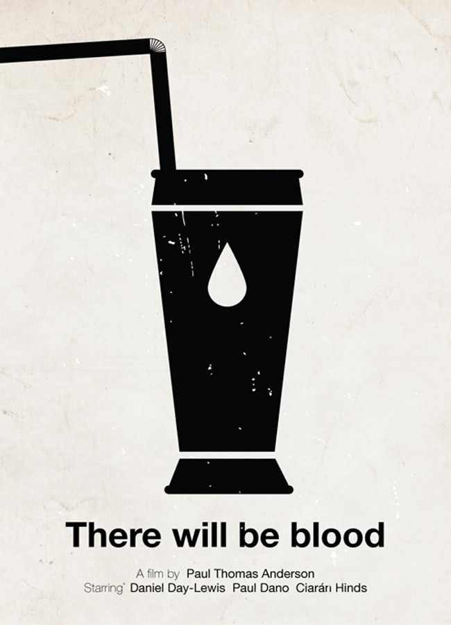
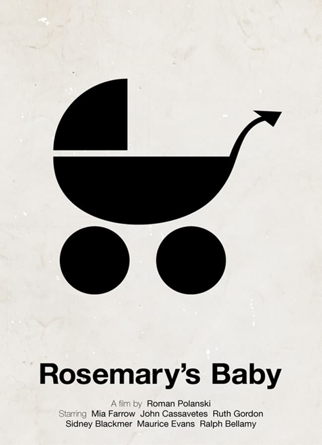
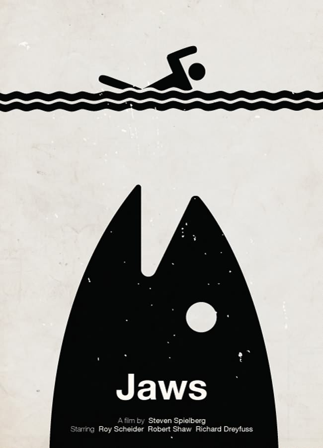
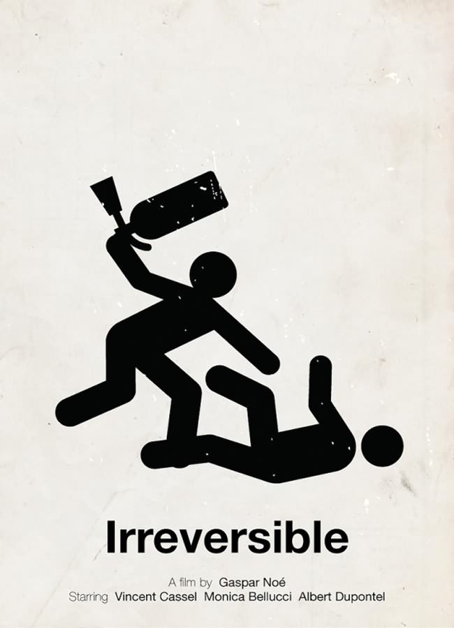
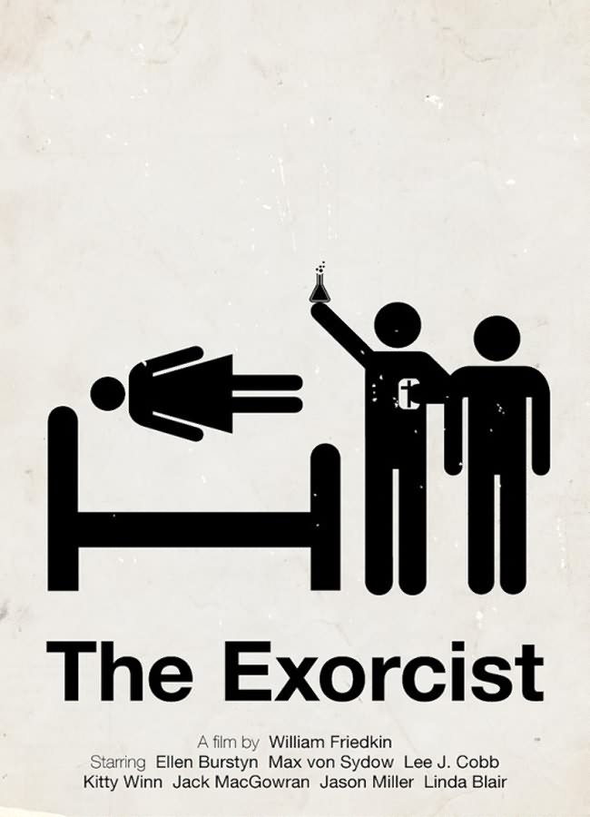
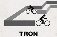
Victor Hertz is a Swedish freelance photographer and graphic designer with a passion for film. Often seen on signs or instruction manuals, pictograms serve as our universal language, a way for all of us to quickly figure out where we’re going or what we’re (not) allowed to do. With this ongoing project, he’s striving to find a balance between the current minimalist poster trend and not being boring … even in black and gray, we think he’s right on target.

He says: “What I do, is that I make a quite simple movie poster, including one or a few pictograms, displaying the theme of the film. Either original pictograms combined, or modified ones, to fit with the film. As the title poster says, I try to bring a twist to it, and not get too simple. I can sometimes feel that all these minimalist movie posters get a bit boring, a bit too simple, with just an object from the film and the title underneath it.”
