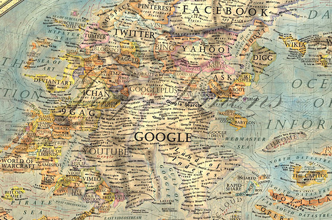
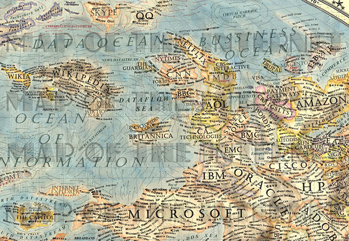
I honestly don’t know where to begin, because this artwork is one of the most wonderful pieces we have ever seen! It’s just a map yet at the same time the effort it took to make this excellent piece a reality is truly breathtaking. No single map, of course, can do justice to the complexity of the relationships between sites, services, and entities as diverse as Google, Cisco, QQ, and BitTorrent. But for tech nerds, the map presents an endlessly fascinating schema for comparing and drawing connections between the various entities that constitute the online world.
Martin Vargic, a student and graphic designer from Slovakia, was inspired to create the map after seeing xkcd’s “Map of the Internet” in 2010. Vargic started by increasing the scale and creating a new model based off National Geographic maps, working 10 hours a day for three weeks. Here’s what Vargic said about this project: “This is definitely not the final version, incredible amount of websites and software companies are not on the map and will be incorporated in later updates. Due to the immense size of the Net, only a miniscule portion of it was chosen to represent it on the map. Otherwise, this map would be unreadable and probably undrawable in entire lifespan of average human being. This poster includes one full map of the internet, 4 minimaps showcasing NSA surveillance, most used social networks, most used internet browser, and worldwide internet penetration, list of Alexa Top 500 websites, quick timeline of the Internet History, top software companies and much more!”


GIPHY App Key not set. Please check settings