Logos are the fundamental element of company’s branding strategy. They are the “face” of a company and it is really important that logo is well-designed so it can be recognizable for the customers. Logos provide essential information about the product for us, so they need to be unique and comprehensible to potential customers.
However, a logo should be matching well with other aspects of a company’s visual presentation: it can be perfectly designed but it can’t look good when it is surrounded by contradictory graphical elements or inconsistent fonts. This is why a logo is the basic unit of a larger brand identity that includes company fonts, colors and document-design guidelines. The color, design, font, pronunciation of a logo influences our brain so we can recognize company the logo is presenting in less than second.
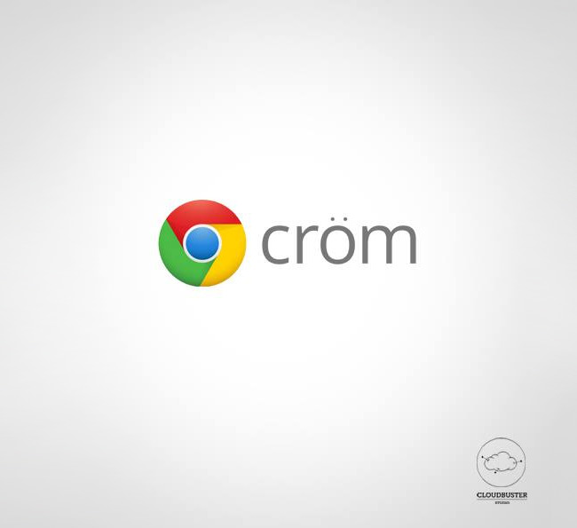
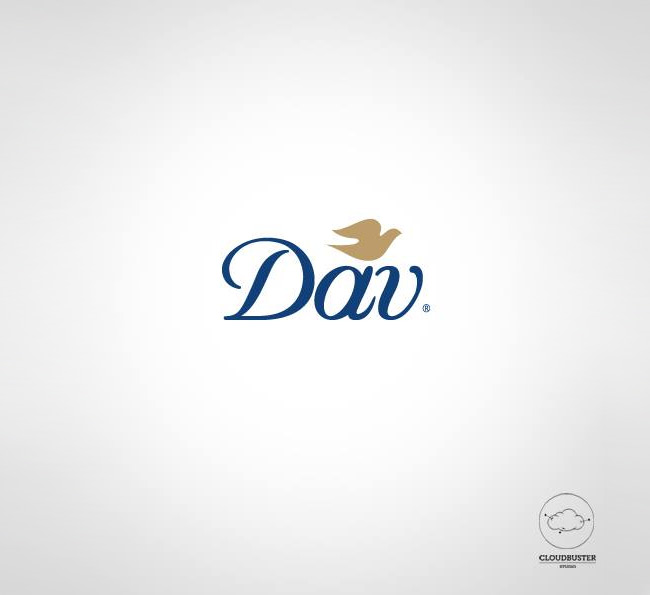
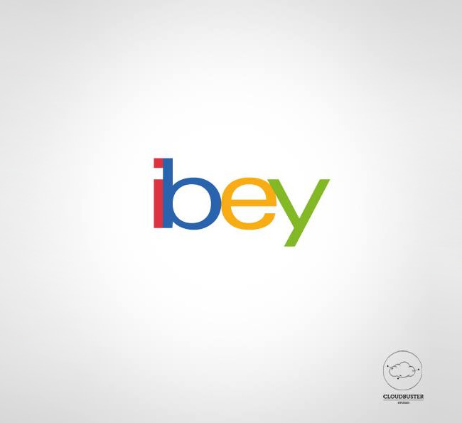
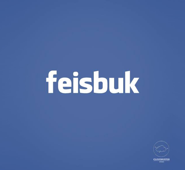
But there is a little problem when logo isn’t pronounced well. Brand names are composed of individual sounds called phonemes and this phonetic structure of brand names affects a consumer’s evaluation of products and their underlying attributes. Consumers use information they gather from phonemes in brand names to infer product attributes and to evaluate brand. The manner in which phonetic effects of brand names manifest is automatic in as much as it is uncontrollable, outside awareness and effortless. So, it is really important for the company that costumer’s pronunciation is in the right way. That’s why the Italian design studio Cloudbuster has designed the series “Fonetica dei Brand”, or logos of famous brands redesigned in phonetic form, and pronounced with Italian accent!
Clodbuster Studio proposes a graphic restyling of the most important international Brands, to lead the Italian consumers to pronounce them in the right way. Now, maybe this change in phonemes might have marketing purpose, but it is sure that it looks funny! Let’s take a look at Cloudbuster Studio’s design.





GIPHY App Key not set. Please check settings